

Evaluating Linear Relationships
One of the most common analyses conducted by data scientists is the evaluation of linear relationships between numeric variables.
These relationships can be visualized using scatterplots, and this step should be taken regardless of any further analyses that are conducted. Regression analyses and correlation coefficients are both commonly used to statistically assess linear relationships, and these analytic techniques are closely related both conceptually and mathematically.
This article will describe scatterplots, correlation coefficients, and linear regression, as well as the relationships between all three statistical tools.
Scatterplots
Scatterplots are used to visually assess the relationship between two numeric variables. Typically, the explanatory variable is placed on the X axis and the independent variable is placed on the Y axis.
The creation of a scatterplot is an essential first step before a correlation or regression analysis is conducted. Correlation coefficients and linear regression only work well to describe relationships that are fairly linear, and the scatterplot makes it easy to see what kind of relationships may be present in your data. Additionally, the scatterplot provides insight into the strength and direction of any possible relationship, which can later be confirmed via statistical analyses.
Let’s look at examples of determining relationship direction, strength, and linearity using scatterplots.
Both relationships pictured below are negative and fairly linear. We know this because as X increases, Y decreases at a relatively constant interval. The scatterplot on the right, however, represents a much stronger negative relationship than the relationship on the left. We can determine this because there is far less spread between the data points. If you picture an imaginary best-fit line slicing through these data, the points in the scatterplot on the right would all fall quite close to that line. Since the linear relationship is strong, knowing an X value tells us more about the possible value of Y in the righthand plot than it does in the lefthand plot.
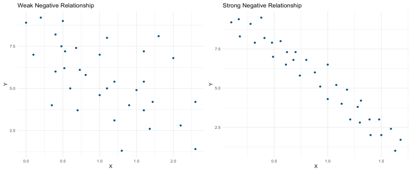
Now, both linear relationships pictured below are positive. As X increases, Y also increases. Yet again, the relationship represented in the scatterplot on the right is far stronger than that in the scatterplot on the left.

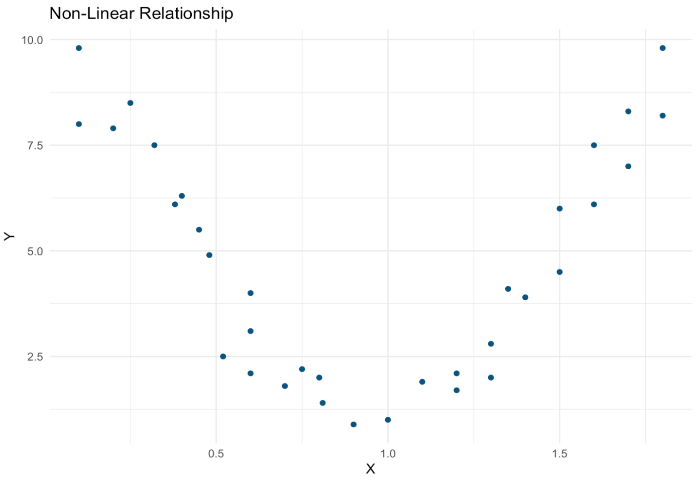
Often, the relationship between two continuous variables isn’t linear at all. One such non-linear relationship is pictured below — as X increases, Y follows a parabolic shape. There appears to be a strong and important relationship between these variables, but it would not be captured by techniques designed to assess linear relationships (e.g., correlation and regression). The possibility of a relationship such as that pictured below underscores the importance of producing a scatterplot before running analyses, as this meaningful relationship could be completely missed in an analysis that skips data visualization.
Correlation Coefficient
Once you’ve seen a somewhat linear relationship on your scatterplot, you can calculate a correlation coefficient to get a number representing the strength of the association. Correlation coefficients can be either negative or positive (which indicates a negative or positive relationship, respectively) and range from -1 to 1, with the ends of this spectrum representing strong relationships and 0 indicating that there is no linear relationship between the variables.
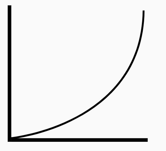
Monotonic, non-linear relationship. Image from https://thenounproject.com/term/graph-curve-up/2064827/
There are two kinds of correlation coefficients that differ slightly from each other. Pearson’s correlation assumes both normality and linearity in the relationship between X and Y. Spearman’s correlation has less stringent assumptions, assuming only that the relationship is monotonic. This means that the relationship has to be consistently increasing or decreasing, but that it does not have to do so in a linear manner (see left). Spearman’s correlation also performs better than Pearson’s correlation in instances where there are outliers or very few data points.
Assuming that both samples (X and Y) are normally distributed, a t-test can be used to assess the statistical significance of either kind of correlation coefficient.
There are a few important limitations of correlation coefficients that should be noted. First, the correlation coefficient only measures the strength of the relationship, not its magnitude (how much does Y increase or decrease with increasing values of X?). Additionally, relationships between more than 2 variables simply can’t be assessed using a basic correlation coefficient.
A single number can only provide so much information, and this value can be misleading without an associated scatterplot. With a large enough n, almost any relationship will be statistically significant in the t-test associated with a correlation coefficient. However, this doesn’t mean that the relationship that you’re seeing is truly meaningful. Usually, linear relationships don’t become visually apparent in a scatterplot unless the correlation coefficient is as high as about |0.7|. Depending on the sample size, however, values much lower than that often reach statistical significance.
Given that correlation coefficients have such a tendency to overstate the meaningfulness of a relationship, this value is often squared to produce an R² value. The smaller squared value tends to be more intuitive, and comes with a convenient interpretation: the R² value tells you the percentage of variation in Y that is explained by variation in X. As useful as R² is, this value still does not provide information about the magnitude of a relationship and cannot describe the relationships between multiple variables.
Let’s assess the correlation coefficients of the positive relationships pictured above. Here are those scatterplots again:
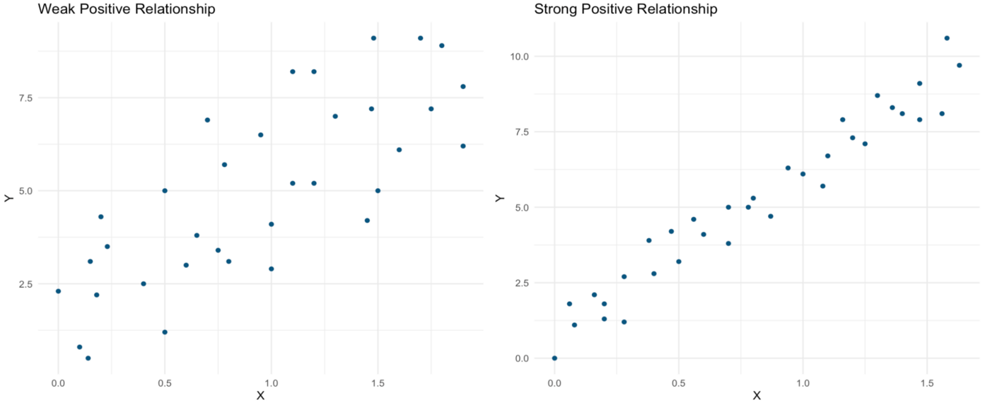
One line of R code is all it takes to produce both the Pearson correlation coefficient and the associated t-test output for the “weak” positive correlation pictured on the left:

As can be seen in the output below, the Pearson correlation coefficient (0.78) is very large even in this “weak” relationship. The p-value associated with the t-test statistic is well below 0.05, indicating a significant relationship:
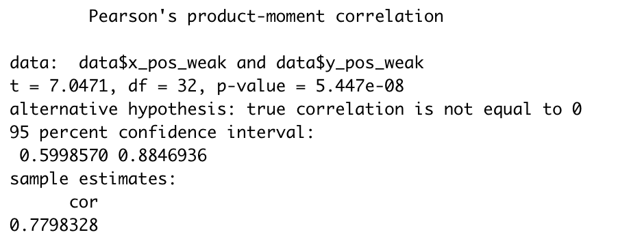
We can now use this correlation coefficient to calculate an R² value, which in this case would be 0.7798328² = 0.61. This lower value seems to better represent our somewhat scattered data, and we can now say that 61% of variation in Y is explained by variation in X.
Now, let’s run this analysis for the “strong” positive relationship pictured above in the right panel:

Now the relationship is almost equivalent to 1, which confirms the very strong relationship that we could observe in the scatterplot above. Yet again, the relationship is statistically significant:
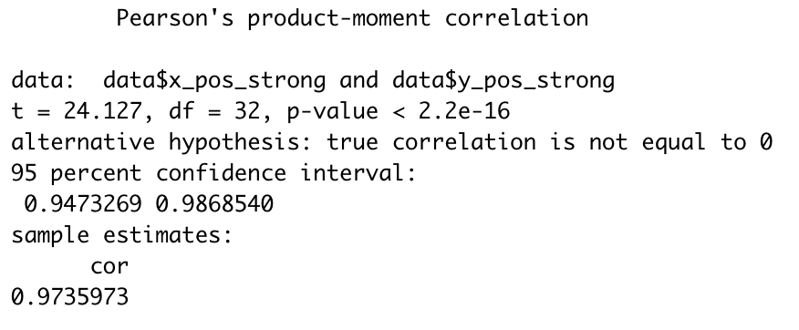
In this case, our R² value (0.9735973²) remains quite close to the Pearson correlation coefficient at 0.95. In other words, 95% of variation in Y is explained by variation in X. Given how strong the relationship appeared to be on the scatterplot, this value still seems to fit the data well.
Linear Regression*
*Note: There are many kinds of regression analyses, and lots of complexity that one can dive into in learning about regression. For the purposes of this article, I am keeping it simple and am focused entirely on linear regression and its relationship with scatterplots and correlation coefficients.
Regression takes correlation a bit further by producing a line which best fits your data. A simple linear regression analysis still provides us with the R² value, but also provides a value representing the magnitude (slope) of the relationship between X and Y. This information enhances our understanding of the underlying relationship, and can be used to predict Y values given a certain value of X. T-tests are still used, but now they test the null hypothesis that the slope of the line representing the relationship between X and Y is zero (magnitude!).
It is also possible to assess relationships involving multiple explanatory variables using linear regression. The magnitude of these relationships can be assessed using the separate slopes that represent the relationship between each included variable and the outcome variable in that model. Additionally, the R² value produced using multiple regression (many X variables) represents the percentage of change in Y that can be explained by all of those variables combined. This additional analytic capability and output allows us to get an even better understanding of the associations present in our data and to represent more complex relationships.
In order to use linear regression appropriately, the following assumptions must be met:
- Independence: All observations are independent of each other, residuals are uncorrelated
- Linearity: The relationship between X and Y is linear
- Homoscedasticity: Constant variance of residuals at different values of X
- Normality: Data should be normally distributed around the regression line
Let’s assume that these criteria are met in our sample data and run regression analyses to test those positive associations visualized earlier.
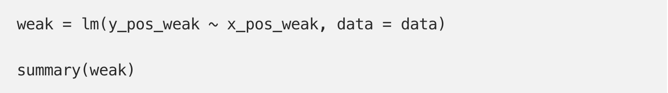
Just a couple of lines of code produce the linear model for our “weak” association:
We can gather a few important things from the output shown below. First, the Multiple R-squared value is exactly equal to that produced by squaring the correlation coefficient. Second, we see that our data can best be described by the following line:
Y = 1.8960 + 3.2711(X)
We now know that on average, for every one-unit increase in X, there is a 3.2711-unit increase in Y. We can also plug X values into this equation to make predictions of Y.
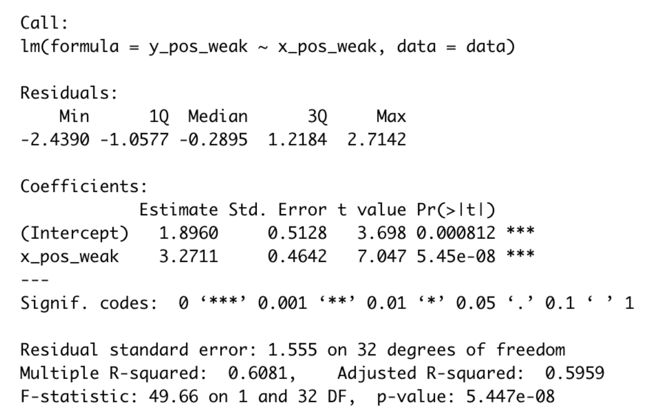
Output for “weak” relationship linear model
Let’s run the model now for our “strong” relationship:
Again, the R² value is consistent with what we calculated before. These data can best be described by the following line:
Y = 0.8041 + 5.4092(X)
Now, Y is expected to increase by 5.4092 units for every 1-unit increase in X. Not only is this relationship stronger, as can be seen by the higher R² value, but its magnitude is also greater as is indicated by this greater slope.
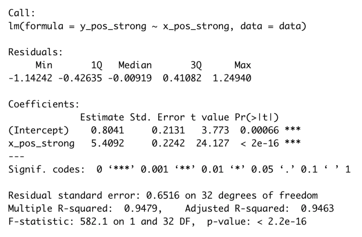
Output for “strong” relationship linear model
While it is tempting to quickly throw data into a regression model to assess linear relationships, it is important to understand what the resulting output means and to visualize the data in a scatterplot before drawing any conclusions.
A GitHub repo containing all relevant code and sample data can be found here.

Trending
-
1 Mental Health Absences Cost NHS £2 Billion Yearly
Riddhi Doshi -
2 Gut Check: A Short Guide to Digestive Health
Daniel Hall -
3 London's EuroEyes Clinic Recognised as Leader in Cataract Correction
Mihir Gadhvi -
4 4 Innovations in Lab Sample Management Enhancing Research Precision
Emily Newton -
5 The Science Behind Addiction and How Rehabs Can Help
Daniel Hall


Comments