

5 Most Interesting Mobile App Design Trends 2018
If you are a business that is connected to a mobile app, you should read this article. If you are also planning to start one, you need to understand how business apps are built.
Mobile apps have become a lot more competitive than before, hence the need for attractive app design is getting stronger than ever. After all, apps that look good, stay longer.
Here at Dikonia, developing apps for business productivity is one of our key lines of business and we would like to share some app development trends for 2018 that will keep you ahead in the design game. Here are the top 5 app development trends of 2018.
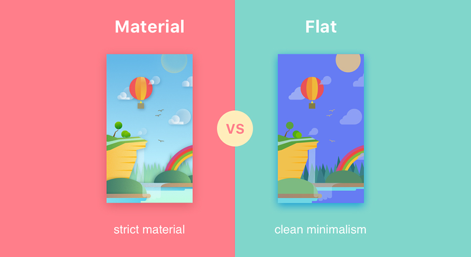
Goodbye Flat, Hello Material
When you look at Material Design, the basic design ideology is to make flat elements that convey an idea in the simplest shape possible. But, Material Design has come a long way from that. It’s no more only flat design.
Until 2017, a lot of developers were relying on simple flat designs for crafting the UI and decorative features of their apps, which should now be best left behind.
It’s time to switch to the newer, more vibrant material design that inculcates the use of shadows, depth effects, overlaps, translucent elements and gradients. These design elements are soothing to the eye and help in retaining users for longer duration on the app screens.
Decluttering the App
A winning app design is intelligent rather than obvious. There are a number of design elements and functionality buttons that your app will need but settling for the least number is the best design tactic you can follow.
App makers have reduced the number of buttons or screen taps, a user has to make to get their job done. This reduces the need for a lot of on screen elements that create “clutter”.
If the users see a ton loads of options on your app, they’re bound to be confused on what to click and what to leave. This becomes really tedious for the user and they’ll eventually look for a simpler app to meet their needs.
Therefore, it’s very necessary that you keep only a handful options upfront and intelligently place buttons for the maximum usability.
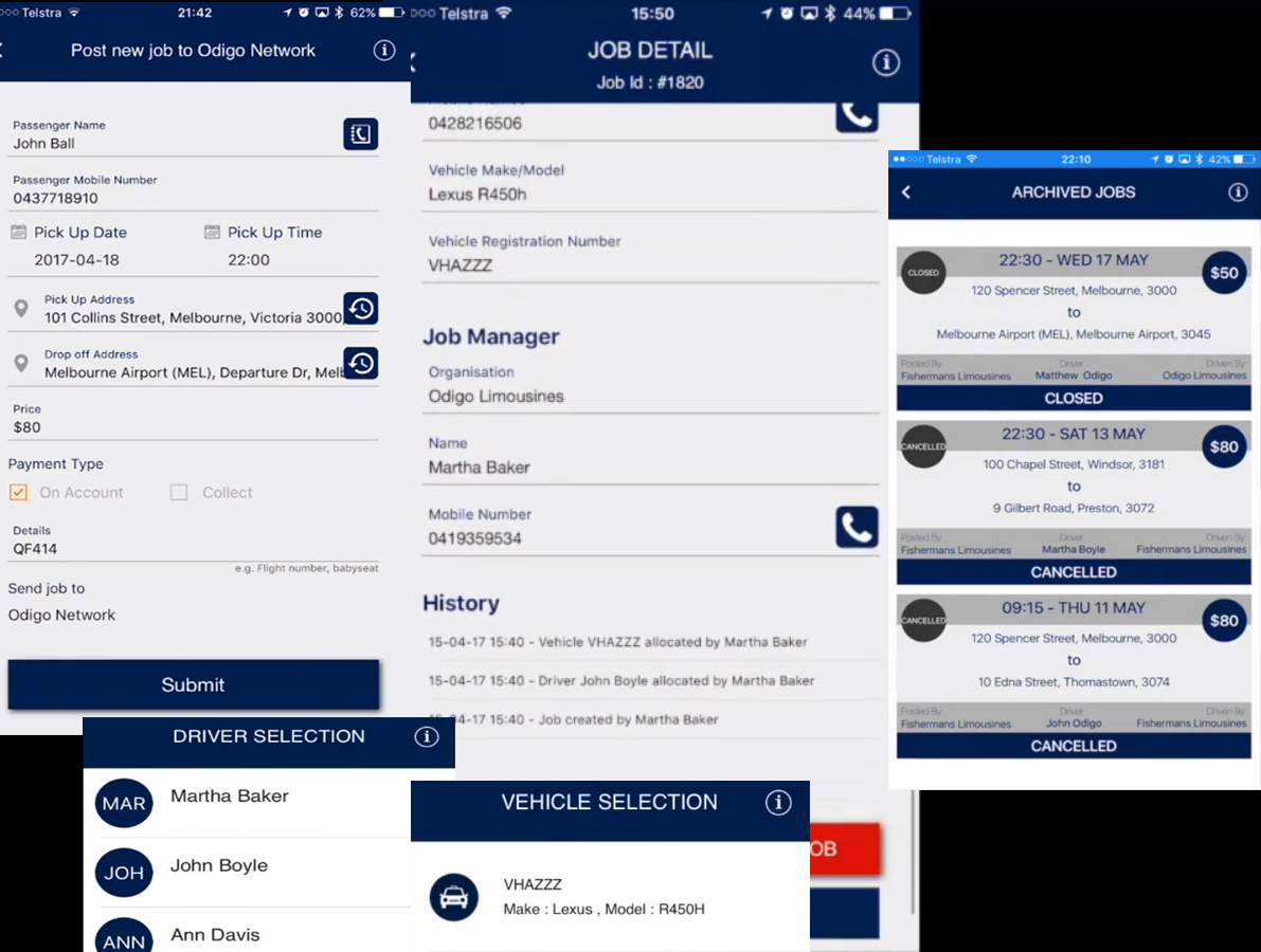
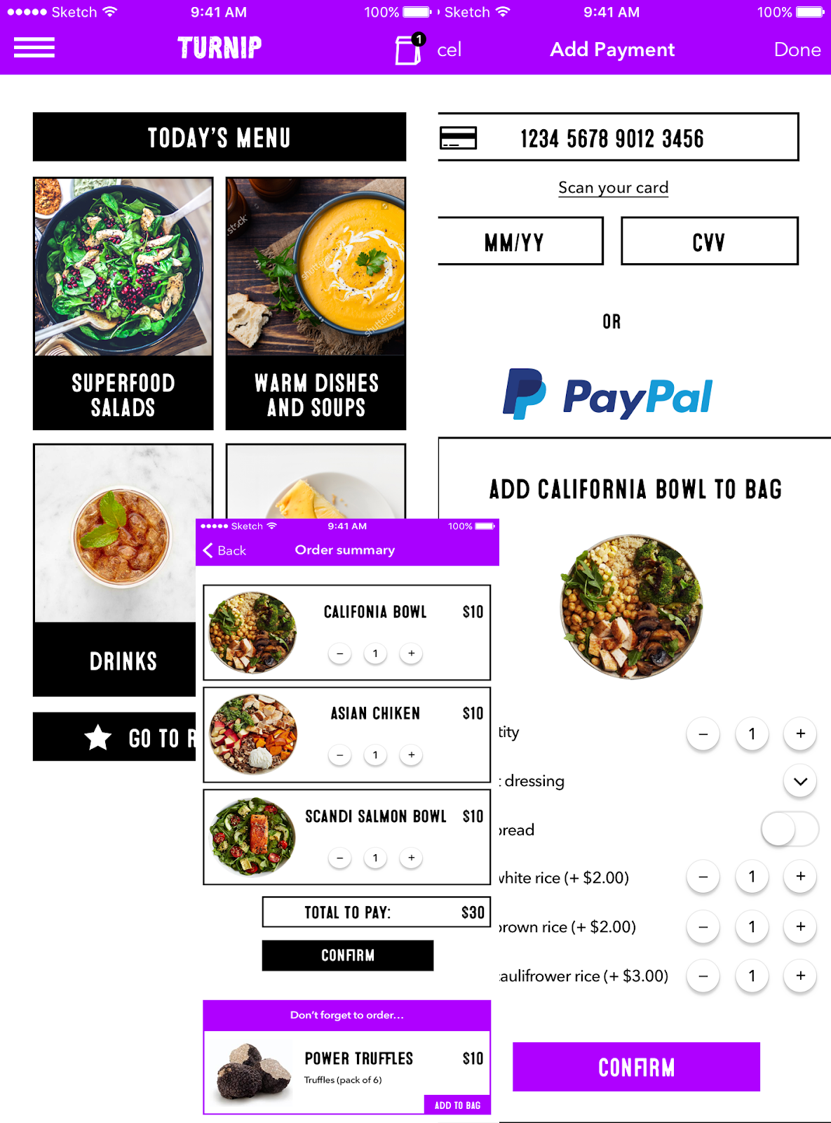
Check out how we applied this point in our latest cab booking project.
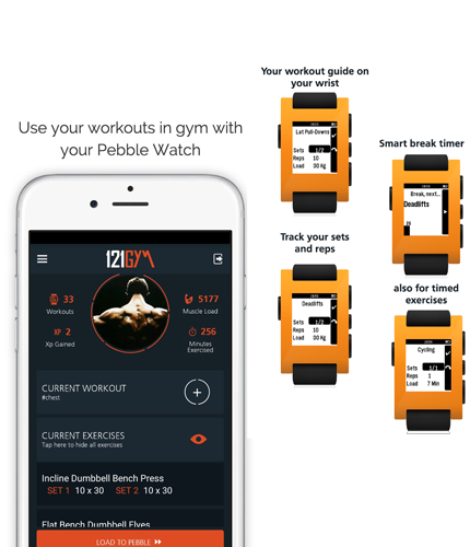
Customized Illustrations
In 2018, we’re fan of graphic design and every app tries to come up with their own digital art that resonates with the user. When you’re getting art made for the app, pay special attention to how your app illustrates something.
This is necessary because no matter how simple your app is easy to use, your users still need some visual clues on how to operate and connect with it on a daily basis.
Using custom made illustrations send out an immediate signal to the user that your app has received a lot of attention for its design. Like the example shown above from a fitness app that we made, you can see that the unique icons and graphics appeal to the user instantly.
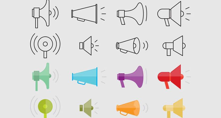
Minimalistic Icon Outlines
It is important to understand that icons are not for decoration. They’ve a specific role to play - helping the user with navigation and UI buttons. Both of which ask for a great deal of user’s attention.
While, the user spends its precious attention on these icons, it is necessary that they are appealing enough to carry the attention forward. For this, you can either make the icons highly complex or you can make them very minimal.
Notice how the outlines are much easier on the eye than the colored shapes.
Doing the latter is always a wise decision because a minimal icon automatically declutters the screen and increases your mobile screen real estate. Minimal icons with only the outlines of the shapes are the latest design trends that you can readily adopt for attractive apps.
Use Contrasting Colors
App coloring scheme is a debatable topic, one that has taken a new turn in recent years. Most app developers are now routing for a high contrast app coloring scheme, where in various elements inside an app contrast from the overall theme of the app.
This helps in making things stand out. Everything that belongs to a particular module has the same color but critical heat map points such as buttons, or CTAs must have contrasting colors.
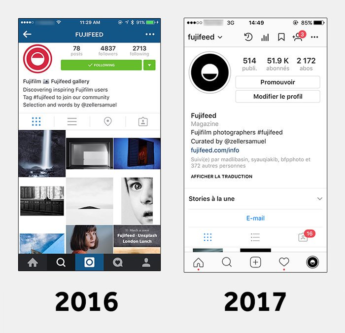
This was seen when Instagram tweaked its UI recently to an overall black and white with a bright pink for notifications. A clever way to simplify things and gain users undivided attention.
Conclusion
Following the above mentioned mobile app design trends, you can make sure your app is aesthetically pleasing yet functionally effective. We at Dikonia have created some innovative solutions for the business federation.
Get in touch with us to discuss your next project or gain more insights into app development.

Trending
-
1 How Does SaaS Differ From IaaS And PaaS?
Fabrice Beaux -
2 Single Page Applications vs Multi-Page Applications
Fabrice Beaux -
3 Top 7 Effective Strategies for Multi-Language Website Development
Fabrice Beaux -
4 Boost Engagement to Infinity and Beyond: Unleashing AI-Driven Support
Anas Bouargane -
5 The Cheapest And Most Beautiful Stickers in CS2
Daniel Hall


Comments